Nicklas Strickland AKA Reno
BFA ’20 Graphic Design
Born in Fayetteville, North Carolina, I come from a less than ideal beginning. I have always had a distinct passion for design and photography. Design was always something I had a connection to, even before I knew what it was, or entailed. I loved posters, logos, old tin cans with type on them, neon signage and more. You name it, I loved it as a kid, and this led me down a rabbit hole I have no intention of getting out of. Growing up underprivileged you begin to see the world in a different way. I see things with my photography others may not understand, and the same applies with my design. From both a social lens, as well as a design/photo lens, I want to produce great works that make me feel something, and that makes others feel something. I think that “something” is what everyone is chasing, and whether it means producing work for myself, or for a company (fingers crossed) I will always carry that desire with me. I am not a person to let how I grew up, or the things that affected me growing up, affect my professional design/photo work. I will always strive to be the best I can be.
– Reno
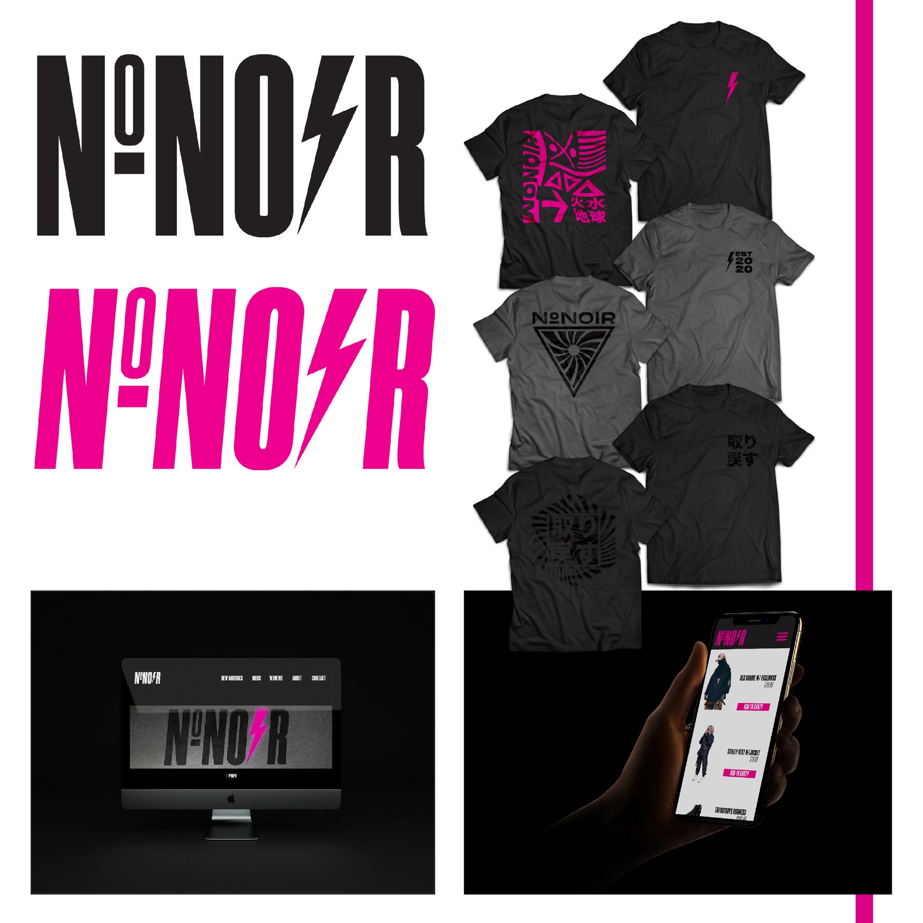
NONOIR, 2020
digital, vinyl, UI/UX
Created as a fictional cyberpunk, modern clothing brand I wanted to create something eye catching. I used many mediums in the creation, from digital creation means, to cutting vinyl for creating t-shirts, to using various programs to create the UI/UX elements. I also created a motion graphic for the app, and webpage for the brand itself, using Adobe Xd, and Adobe After Effects.
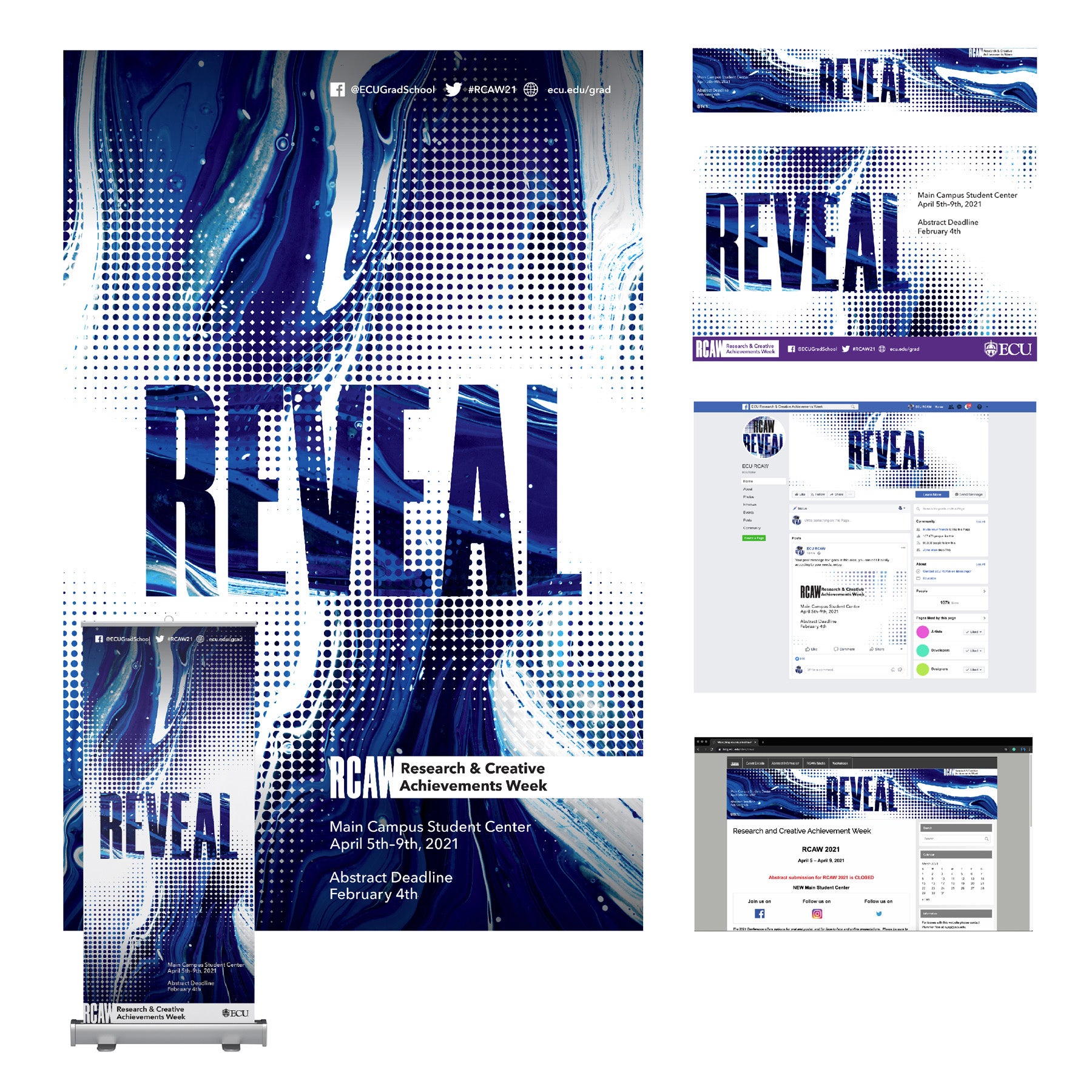
RCAW, 2020
digital, vinyl, UI/UX
I used the acrylic pour technique to create the background, and I changed the color in Photoshop. Using various design techniques, I also created the texture on the piece. The mockups created were for its various usage for digital purposes, incorporating UI/UX techniques.
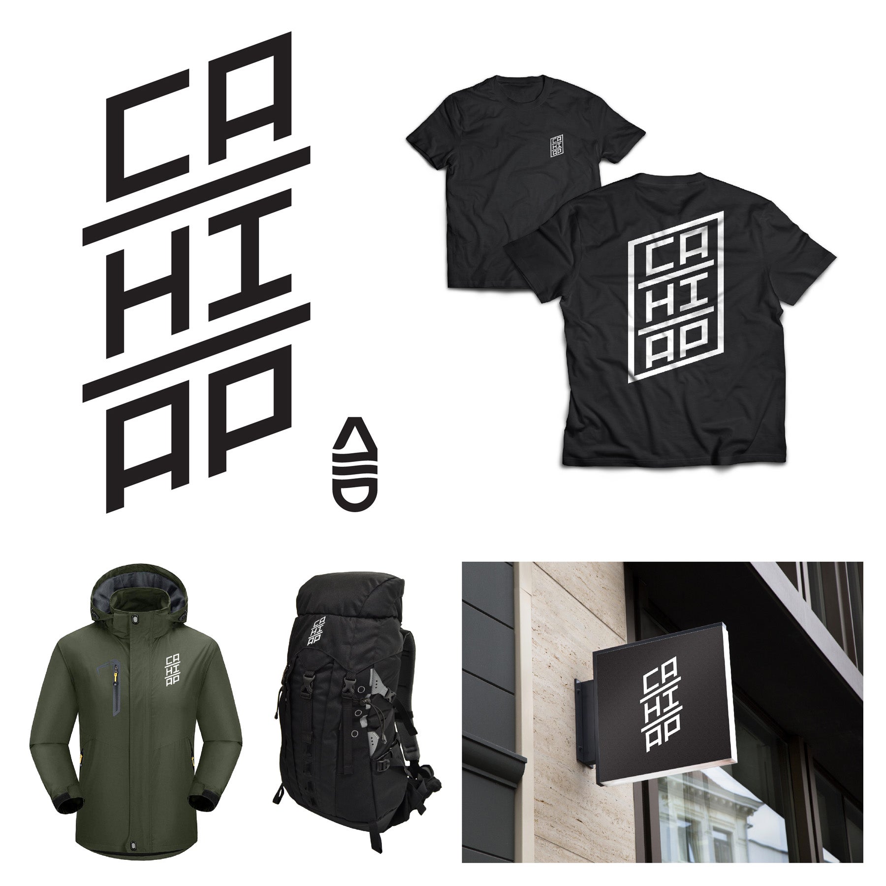
CAHIAP, 2019
digital
CAHIAP is an acronym for Camping, Hiking & Apparel. I was inspired by camping companies like REI, Salamander, and Patagonia. So, I wanted to create a fictional brand to explore this idea and push it further. The icon is meant to represent a mountain, river, and tent, as the whole form is a carabiner. A tool hikers and rock climbers use when traversing tough terrain.
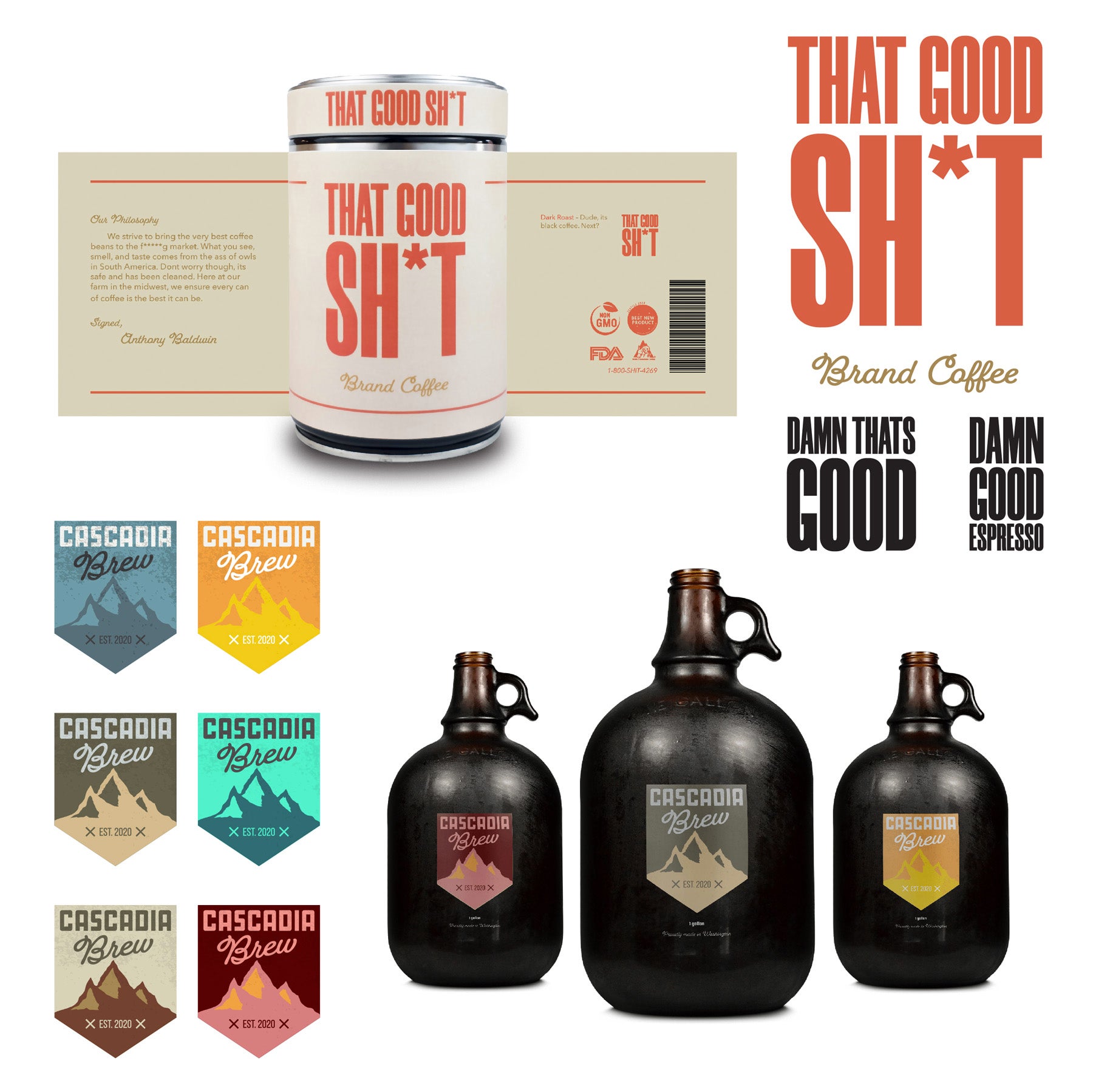
Label Designs, 2020
digital photography
These are designs I created to have some fun, as well as to explore labels for fictional companies. THAT GOOD SH*T Brand Coffee and Cascadia Brew are inspired by my love for the PNW or Pacific Northwest. I got the idea for the coffee company as I was visiting downtown Portland, Oregon, and saw the abundance of coffee shops. The alcoholic beverage company was inspired by the mountains I witnessed while visiting the Washington, Oregon area. For the coffee brand, I took an image of a real can and overlayed the label, because I couldn’t find a can I liked on any popular mock-up sites.
Connect with Reno
Website: nicklasstrickland.com
Instagram: @designer_reno | @photographer_reno
LinkedIn: nicklassstrickland